Why it's crucial to get your CTAs right
When was the last time you did your research about Call To Actions (CTAs) for your website? And when was the last time you felt excited about working on yours?
It might not seem like the sexiest small business subject, but CTAs are a really important factor when it comes to running your small business. So much so that clear, specific CTAs can boost conversion rates by up to 161% and relevant, well-placed CTAs can increase revenue by an average of 83%* - I don't know about you, but that sounds pretty sexy to me!
Let's start with a definition
A CTA is a concise and persuasive prompt encouraging or directing individuals to take a specific action*.
They can be at the end of social media captions, clickable options on YouTube videos and buttons under products or text on a website, which is what we'll focus on here. You will have seen them plenty of times - they include prompts like 'Book now', 'Find out more' and 'Sign up here'.
Why CTAs matter more than you think
It's easy to see a CTA as a generic bit of text to input on the button of your website template. However, a CTA is actually a strategic bit of text that performs an important function in your customer journey and sales strategy - it tells your customer how they can take the next step in supporting your small business.
This can be something like signing up for your newsletter, reading more about your signature product or service, or buying said product/service. As they spend time on your website, a CTA takes the guesswork out of their decision-making and tells them exactly what to do next.
For you, it prompts them to take an action and creates a conversion on your website, which is precisely what we want them to do!
Without one, your customer is more likely to close your website because - what would they do next anyway? They've gotten what they were looking for.
Getting eyes on your website is hard enough, so when they land on your homepage, we really want them to stick around for a while and follow the journey you’ve painstakingly laid out for them. Unfortunately, it's common for small business websites to have no CTAs on their homepage, with only 30% of B2B websites having one*.
The more business owners I inspire to sort this out, the better!
Common CTA mistakes to avoid
There are plenty of CTA mistakes I’ve come across in my time as a web designer, as it’s such a forgotten area for small businesses. Luckily, a bit of strategy and insight goes a long way here, so let’s start by highlighting some of the biggest mistakes I’ve seen so that you can avoid them going forward:
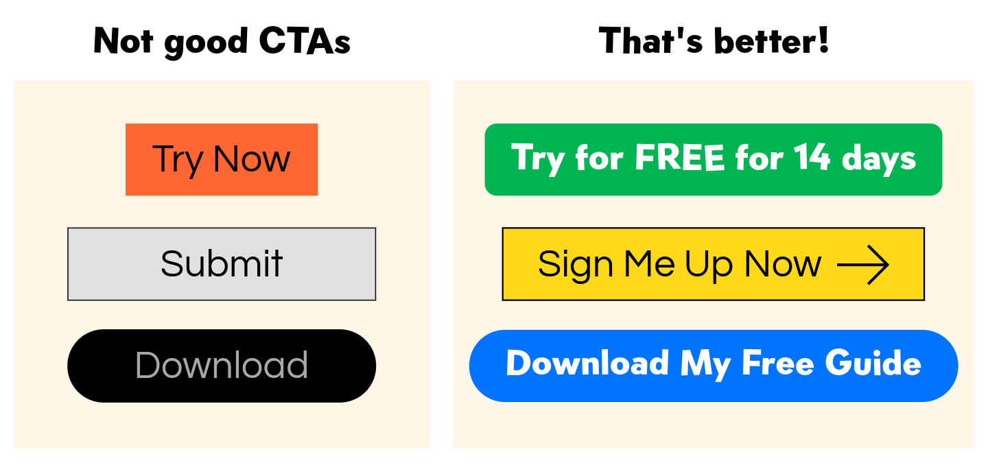
Use of generic CTAs like ‘Click here’ or ‘Submit’ don’t explain what will happen after clicking or inspire the reader to click at all
No CTAs or too many CTAs don’t give the reader an action to follow and confuses them on what to click on altogether
If your CTAs are too difficult to find, then they’re pointless. They should always directly follow or sit within an appropriate section
Poor design, such as difficult-to-read colour combinations and/or fonts, will defeat the point of your CTA
An example of how CTAs can be improved with a little bit of design
What makes a great CTA?
Rather than borrowing the CTAs from your web template or going with the generic classics, it will serve you to put a bit of thought into making your CTA catchy and specific to your brand. For example, using first-person language such as ‘Start my free trial’ rather than ‘Start a free trial’ can contribute to click-through rate by a whopping 90%*!
Here are the four principles to follow when crafting the perfect CTA:
Clarity - Make what will happen next clear, taking the guesswork away from the customer
Trust - Show social proof nearby to build confidence in your customer and make your CTA an accurate description of what happens when they click and takes them where you’ve promised
Accessibility - Make the CTA easy to find, see and read, so be careful with your colours and fonts here
Persuasion - Grab the reader’s attention and make it something they won't want to miss out on, encouraging them to take action.
How to improve your CTAs
It's always exciting to me when a small tweak or strategic choice on a website can hold the potential for a huge shift for the success of a small business. It's something I come across often in my work, but the humble CTA typically sits in the shadows of flashier improvements such as branding, photography and design.
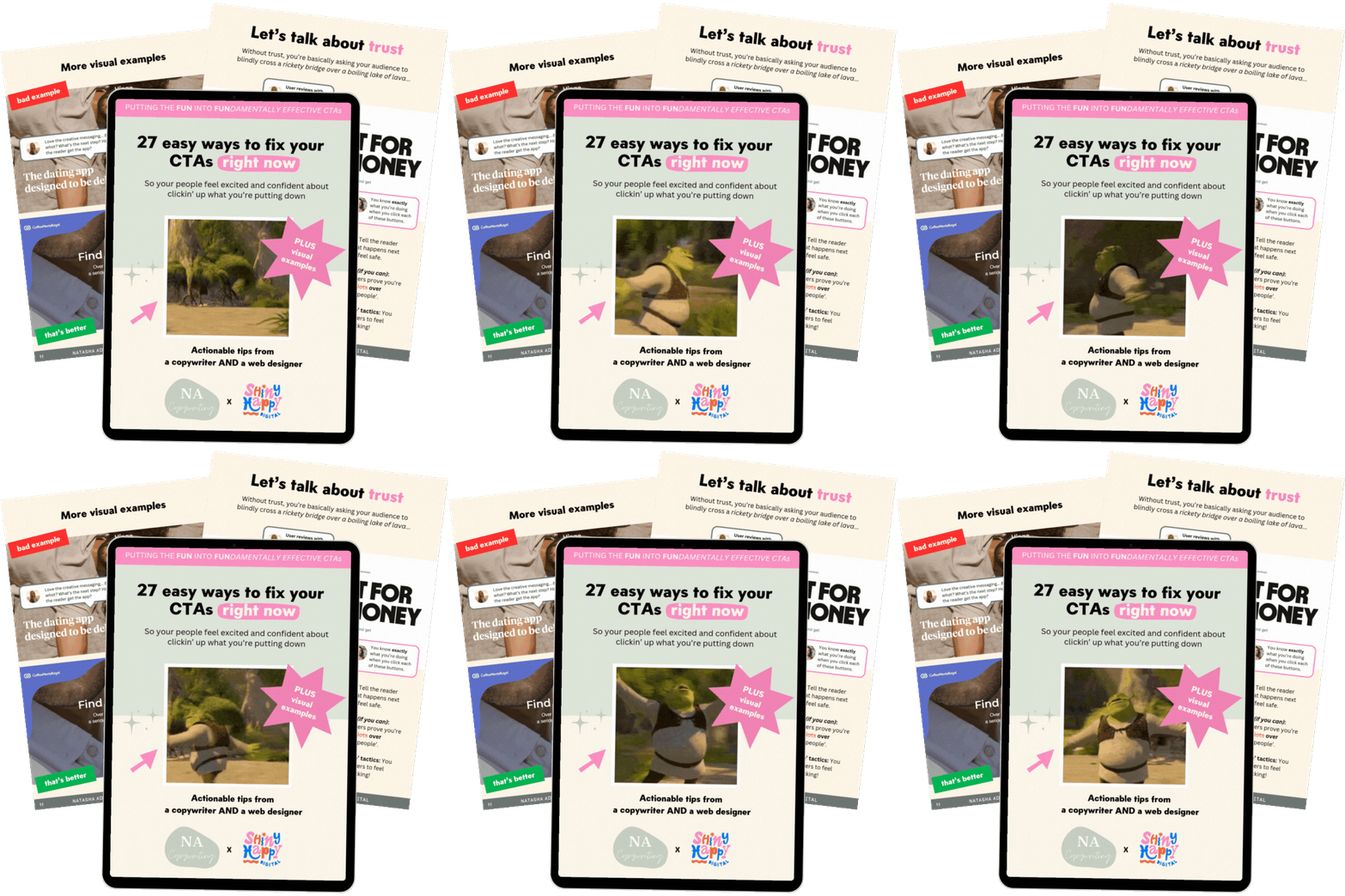
This is exactly why Natasha (@natasha_adlam_copywriting) and I have created an easy-to-action freebie with a tick list of 27 improvements you can make to the design and copy of your CTAs. It’s full of visual examples and clever analogies to illustrate exactly what each fix does and how it contributes to making your website an easier place to navigate (and get conversions).
Get the CTA freebie guide here and fix your CTAs today!
*All stats from Sender's '40+ Latest Call to Action Statistics for 2025'
pick my brains on how to improve your ctas
Book a Happy Hour for £150 and ask me anything you want about my processes, tools, tips or even a walkthrough.


